6 Auto Repair Web Design Mistakes — and How to Fix Them
While we would all love to spend our money on basic bills and then enjoy the rest purchasing things to treat ourselves, often in life things that require you to change your spending and take care of something you didn’t know you would need. Automotive repairs are one of the first things that pop into my mind when thinking about sudden emergencies that require extra spending.
While yes, you should take care of your vehicle with regular upkeep and maintenance, often damages or problems happen with little warning. And for the vast majority of people living in today’s world without a working vehicle is impossible.
But when you need repairs, advice, and quality service you might find it hard to pick who to go to. It doesn’t matter if you have a Honda, a BMW, or a Ford, customers today expect quality.
There are hundreds of choices in some areas for Auto repairs. With the speed and ease of the internet, most can find multiple choices quickly when your afternoon comes to a halt because something is wrong with your vehicle.
So websites and customer feedback online often are the first things possible customers see when trying to decide which shop to use. With that let’s look at the six worst auto repair web design mistakes and how we would fix them. Ultimately, that will help give your business a better first impression with possible customers.
1: Cluttered and Hard to Read Layouts:
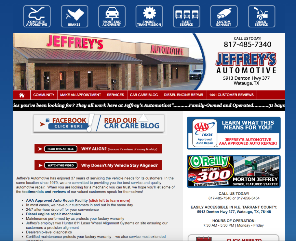
One of the most common issues that I’ve found when looking over some auto repair websites around my city was that half of the sites were barely readable. Obviously one of the main objectives of a website is for people to be able to read and understand what it is your business can provide. Multiple sizes of font within the same pages explaining services, strange color choices with backgrounds or even words, and odd layouts that leave you thinking the page was put together in five minutes.

Example: http://www.jeffreysautomotive.com/
While a fun or different website can set yours apart, a hard-to-read or cluttered page can turn away business. Even impressive-looking designs can be hard to read when the pages become too packed with content. It represents your business online so makes viewers think professionally but also simply. Clean and simple with the base outline and easy-to-read fonts help viewers not have to strain simply to browse and understand your services.
2: Non-responsive site:
A website is responsive when it is designed to adapt to the screen size and device it is being viewed on. It adjusts to fit and look better with the screen on which the user is reading it. This helps people viewing your page on their phones, tablets, or other small devices. Often someone needing auto repair might be on the go or even in their car having issues when deciding that they finally need to fix that problem they’ve been putting off. A responsive design adjusts to help your viewers not have to adjust and work for themselves to experience your website.
When viewing an older website on a phone or tablet you most likely have to adjust and play with the browser to really view the site or find what you are looking for because the site’s print and design are built for a completely different screen. The design does not fit and forces the viewer to spend extra time searching and adjusting for what they need. Building a responsive site now has become a lot easier and many website design providers push it as the way to go to help your site transition to the mobile age.
3: Click-To-Call:
Keeping with the idea that many people will view auto repair sites on mobile devices, a click-to-call option is something that can be coded into your website that encourages viewers to at least call your business. And getting them to reach out even a little then gives you and your employees a chance to interact and sell your brand.

Example: http://www.autorepairfortworth.org/
Most auto repair sites I see have their phone number plastered up top or somewhere noticeable on each page (if they don’t, they will likely never receive any calls based on their site), but many of the non-chain places do not have a way whereby simply tapping a number or link I could be talking with someone quickly about fixing my problems.
4: Reviews and Feedback:
Sadly almost anyone who has owned and paid for vehicles for more than a few years has likely needed to get multiple repairs done over the years. And with that, if they have used multiple repair shops it is because they had a bad experience somewhere before. Automotive repair shops often can pull customers in with solid reviews from past or continuing customers. Being a part of the Better Business Bureau or having certified techs can be encouraging as well. Show that off!

Example: http://www.wadesqualityautorepair.com/
Having a page within the site that links to customer feedback sources (Google, Angie’s List, etc) or even has recent reviews on it shows potential new customers that your business can not only get the job done but also expects that they will satisfied with the experience. Links and shortcuts to social media pages also help even if you don’t think social media matters as well. Facebook and Twitter pages can provide people with ways to again communicate with a business, and also see feedback from other people in their own neighborhood.
5: List and Explain Services Provided:
Another thing common with most of the websites that I found around me for auto repair businesses was they listed what types of services they could provide. But even some of the best sites simply listed some services and then left it at that. While again you don’t want to clutter up a page on the site naming every single service your shop has ever done, giving customers some of the services that your shop specializes in can encourage them to make that jump to contact the shop.

Example: http://www.tcmautomotive.com/
Can you do alignments? Transmission repairs and rebuilds? Automotive customization? Naming some of the services that a business can provide and possible areas of expertise that technicians have over your competitor a couple of miles down the road could make the difference.
6:Call The Customer to Action:
Multiple sites I viewed listed a little about the business, named a few types of repair that they can offer, and even had ways for me to contact them but were missing something every business site should have, something encouraging me to actually use them! A quick and thoughtful few lines trying to push me to use them.

Example: http://billshalfpriceautorepair.com/
A sentimental line about family values and hoping to shake my hand at the end of a successful job. Something to encourage and welcome me as the viewer to make that step to contact them. The click-to-call option helps but often at the bottom of the main page and pages about services, the most encouraging and friendly sites did leave a feeling that I should reach out next time I needed help.
The field of Automotive repair is flooded in many areas. And again with mobile technology and the internet, potential customers looking to get that surprise issue fixed have the ability to quickly research what their options are when in need.
So improving and working on your website can pull customers in when often that is your first interaction with them in today’s world. Especially when it is an interaction that can decide in a few minutes if that person will ever contact a business or not.


